How to Read a Candlestick Chart and Spot What Buyers and Sellers Are Really Doing

A stock closes at $50 on Monday and $50 on Tuesday. Same price, right? Not quite. One day saw fierce buying that faded by the bell, the other saw panic selling that reversed in the final hour . A line chart shows you nothing. A candlestick chart shows you the battle.
The open, high, low, and close reveal the psychological battle between buyers and sellers at every moment.
What you're actually looking at
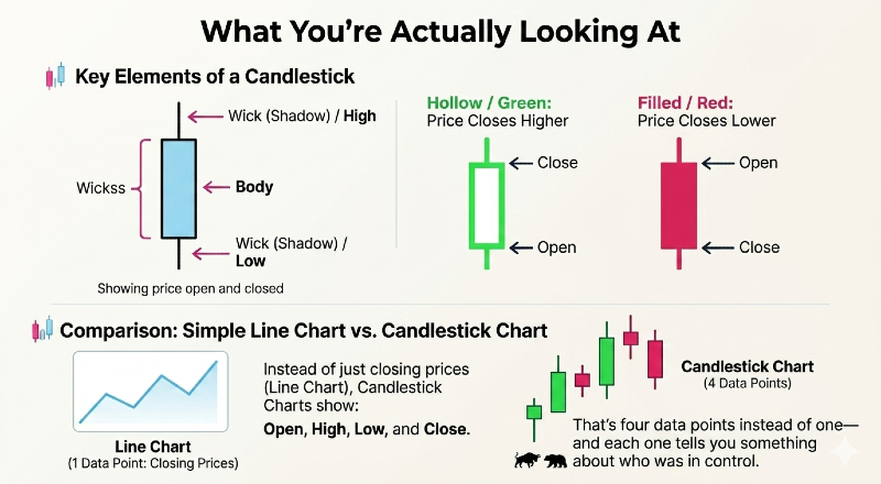
Each candlestick has a body — the thick part showing where price opened and closed — and shadows (or wicks) extending above and below to mark the high and low . When the stock closes higher than it opened, you see a hollow or green candlestick, with the bottom representing the open and the top representing the close . When it closes lower, you see a filled or red candlestick, with the top showing the open and the bottom showing the close .
Unlike simple line charts, which display only closing prices over time, candlestick charts include the open, high, low, and close . That's four data points instead of one — and each one tells you something about who was in control.
How the body and wicks tell the story
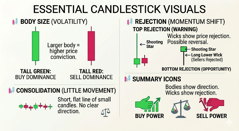
The longer the body, the more intense the buying or selling pressure . A tall green candle means buyers dominated from open to close. A tall red candle means sellers crushed the rally attempt. Short candlesticks indicate little price movement and represent consolidation — neither side won.
The wicks matter just as much. A long upper wick shows buyers tried to push higher but got rejected. A shooting star — a candle with a small body near the low and a long upper wick — reflects a failed attempt by buyers to push prices higher, quickly reversed by selling pressure before the close . It's a warning that momentum is shifting.
Long lower wicks tell the opposite story: sellers drove price down, but buyers stepped in and reclaimed control by the close. That kind of rejection at the low can signal the start of a reversal.
The patterns that reveal turning points
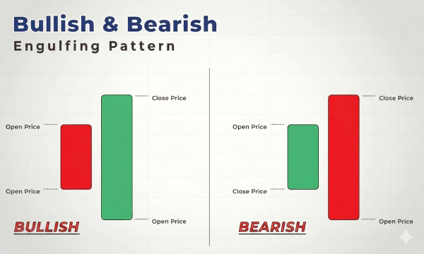
Single candles matter. Patterns of two or three candles matter more. The bearish engulfing pattern involves a small bullish candle followed by a larger bearish candle that completely engulfs the first, showing sellers have entered the market with force and taken control from buyers . It often appears at the top of an uptrend, signaling exhaustion.
On the flip side, the bullish engulfing pattern consists of a small bearish candle followed by a larger bullish candle, indicating selling pressure is weakening while buyers are coming in strong . When this appears after a downtrend, it suggests the tide is turning.
The evening star — three candles including a large bullish candle, a small indecisive one, and a strong bearish close — marks the exhaustion of upward momentum and the start of a downtrend . Its opposite, the morning star, does the reverse at a bottom.
Why volume is the missing piece
Price without volume tells only half the story — volume reveals the strength behind a price move, whether it's backed by real interest or just a temporary fluctuation . If a bullish pattern is accompanied by high trading volume, it suggests strong buying pressure and increases the probability of a bullish continuation . Low volume during a pattern may indicate a lack of conviction among traders .
Watch for volume spikes at key moments. A shooting star with high volume at the top may indicate strong selling pressure and a potential reversal . A breakout above resistance on triple the normal volume tells you institutions are participating. A breakout on weak volume tells you it's likely to fail.
Volume measures the strength behind price movements, reflecting market participation and confidence — when price changes occur with high volume, they often indicate more reliable trends .
What not to do
Candlestick patterns should not be viewed in isolation — it is essential to confirm these patterns with other technical indicators or tools to increase the accuracy of your analysis . A hammer at support means more when the RSI is oversold and volume is rising. An engulfing pattern means less if it appears mid-trend with no nearby support or resistance.
Don't chase every pattern you see. Context matters. Is the stock in a strong trend or choppy range? Did the pattern form at a key level or in the middle of nowhere? Is broader market sentiment aligned or fighting against the signal?
And remember: candlesticks show you what happened, not what will happen. They reveal the psychology of the moment — who controlled the session, who won the battle. But the war continues tomorrow.
This article is for educational purposes only and does not constitute financial advice. Always do your own research before making any investment decisions.